

Custom Pie charts is a feature in Meraki that helps you to answer some of the most common questions that are often asked about how internet connections are used – the most common of all being “how much of our bandwidth is being used for non work activities?”
After you have defined what constitutes work traffic, you get a pie chart that breaks down all the usage into categories you specify. This is displayed on the Clients page in the dashboard – click the right arrow from the default Applications chart to get to it most quickly.
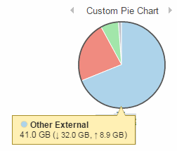 Hovering over a slice of the pie will give you the specific details about the category represented.
Clicking the More link under the chart displays a table showing the details about all the categories.
The chart is also shown on individual client pages, showing the breakdown for that particular client.
How to create your custom pie charts
The first thing to note is that charts are created per network. If you are using a network as a template. its chart will get copied as part of the setup process, but if you adjust the chart later, you’ll need to apply the change to other networks as well. I haven’t explored the Configuration Templates feature of Meraki yet, but one might suppose this resolves this issue. Please comment if you know whether this is the case or not.
The first thing you need to do is decide what constitutes work traffic somehow. If everything is hosted within your LAN or at fixed data centres, then that is pretty straightforward. If you are using hosted services such as Office 365, then things are slightly more complicated.
A simple example
Meraki’s documentation about how to configure this is a bit hidden in this knowledgebase article. I hope I can build on that by working through an example.
At the start of this example we’ll assume that work traffic is just on the LAN, and everything else isn’t work. Obviously that isn’t very realistic but we’ll build on it.
In this example, the LAN uses addresses on a class A network, represented by 10.0.0.0/8.
Everything else is represented by 0.0.0.0/0.
The interface for creating slices is on the General page of a network, under the Traffic Analysis section.

Above I have selected to use Detailed Traffic Analysis – this keeps a record of all the hostnames and IP addresses requested, and is also useful to leave enabled for your out of the box application analysis.
I also added a slice in order to show the boxes. In the name column, you provide the Name for the slice. The signature is based on HTTP hostname (not just HTTP traffic is measured though), the IP subnet or address, ports or a combination of IP addresses and ports.
Let’s apply our work and non work rules to start creating the pie chart.
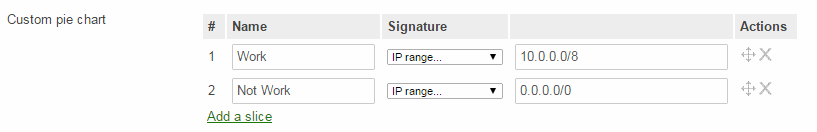
Note that the rules are applied starting with the first. Anything that matches is a rule will not be matched further down, so put your catch all rule (0.0.0.0/0) at the bottom. You can drag your rules up and down using the  icon.
icon.
Once the traffic has been analysed, you’d get a simple custom pie chart showing Work (or internal) and Not Work (or external) traffic.
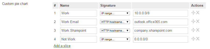
In the real world. there are probably some externally hosted services that constitute work. Let’s say that staff access email hosted on Office 365 via the web interface, and files are stored in a Office 365 SharePoint instance.
Perhaps you want to monitor the use of a specific system hosted on your LAN. As long as you can identify traffic to and from it via a hostname or IP address then you can graph it. In this case, its a CRM system accessed vie the hostname companycrm.
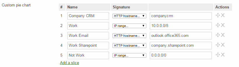
By placing it above the Work rule, this will be matched first which is necessary to graph it separately.
As you can see you can build up your rules to get quite complex reports on bandwidth use. It’s very flexible so you can use it to slice and dice your bandwidth reports in the way most useful to you.
After you save the changes, it will take a while for Meraki’s servers to crunch the data and produce a graph (and it seems to show partial graphs during the process) so leave it a couple of hours or overnight before marvelling at your charts.
If you find this useful, please share your experience in the comments, and please do share any tips that make this feature any more useful.
